Plot Metric
[1]:
import gnss_lib_py as glp

# load Android Google Challenge data
glp.make_dir("../data")
!wget https://raw.githubusercontent.com/Stanford-NavLab/gnss_lib_py/main/data/unit_test/google_decimeter_2021/Pixel4XL_derived.csv --quiet -nc -O "../data/Pixel4XL_derived.csv"
derived_data = glp.AndroidDerived2021("../data/Pixel4XL_derived.csv", remove_timing_outliers=False)
Note: In this case, the example data is filtered to be seconds apart, in the regular setting, such measurements would be removed. To prevent this from happening, we set remove_timing_outliers to False here. For the full dataset, set this flag to True
Plot Metric
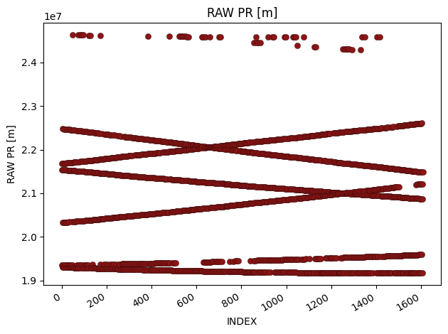
plot_metric is the most basic plotting function to plot a row. You need to input the navdata object and what row(s) you want to plot. For single rows, it will plot against a default index.
[2]:
glonass_data = derived_data.where("gnss_id","glonass")
fig = glp.plot_metric(glonass_data, "raw_pr_m", linestyle="None")
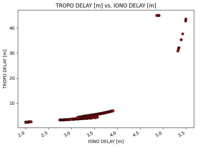
You can also use plot_metric to plot two rows against each other.
[3]:
fig = glp.plot_metric(glonass_data, "iono_delay_m", "tropo_delay_m", linestyle="none")
For a more informative plot, you can also use the groupby flag to choose a row by which to group.
[4]:
fig = glp.plot_metric(glonass_data, "iono_delay_m", "tropo_delay_m", groupby="sv_id")
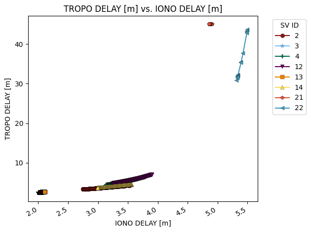
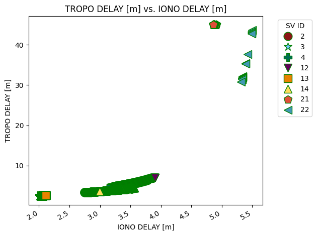
plot_metric also allows you to pass in arbitrary arguments to the matplotlib.pyplot.plot function call as additional arguments like linestyle="None" to remove lines, marker="None" to remove the markers, etc.
[5]:
fig = glp.plot_metric(glonass_data, "iono_delay_m", "tropo_delay_m", groupby="sv_id",
                  linestyle="None", markeredgecolor="g", markersize=12,
                  markeredgewidth=1.0)
By default, the visualization tools do not save to file, but you can save them to file by setting the save flag to True. Check the reference documentation for full explanations. Setting save=True will default to saving in the Results folder, but exact locations can be specified with fname.
Plot Metric by Constellation
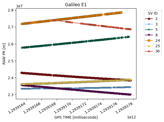
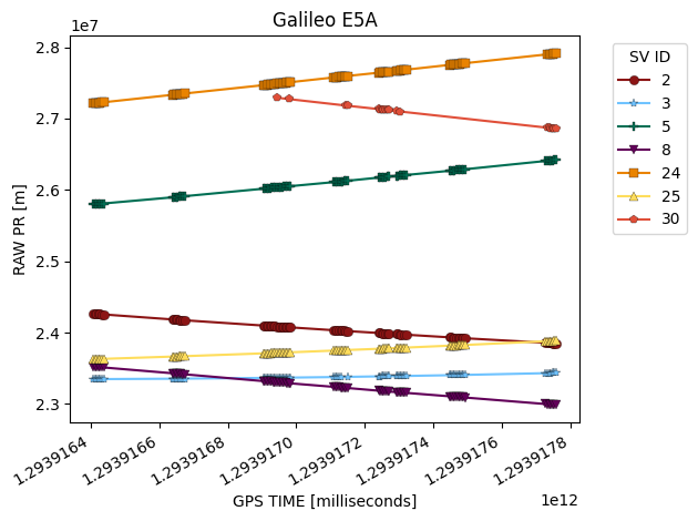
plot_metric_by_constellation is similar to plot_metric but it breaks up the data into separate figures by constellation and signal type. You need values for rows called sv_id and signal_type to use this function. We can quickly see that the raw pseudorange value is much more informative when we can separate by constellation and satellite!
[6]:
galileo_data = derived_data.where("gnss_id","galileo")
fig = glp.plot_metric_by_constellation(galileo_data, "gps_millis", "raw_pr_m")
