Plotting Style
The visualizations.py file contains several plotting functionalities. We’ll use some existing data to demonstrate their functionality.
Note: In this case, the example data is filtered to be seconds apart, in the regular setting, such measurements would be removed. To prevent this from happening, we set remove_timing_outliers to False here. For the full dataset, set this flag to True
[1]:
import gnss_lib_py as glp

# load Android Google Challenge data
glp.make_dir("../data")
!wget https://raw.githubusercontent.com/Stanford-NavLab/gnss_lib_py/main/data/unit_test/google_decimeter_2021/Pixel4XL_derived.csv --quiet -nc -O "../data/Pixel4XL_derived.csv"
derived_data = glp.AndroidDerived2021("../data/Pixel4XL_derived.csv", remove_timing_outliers=False)
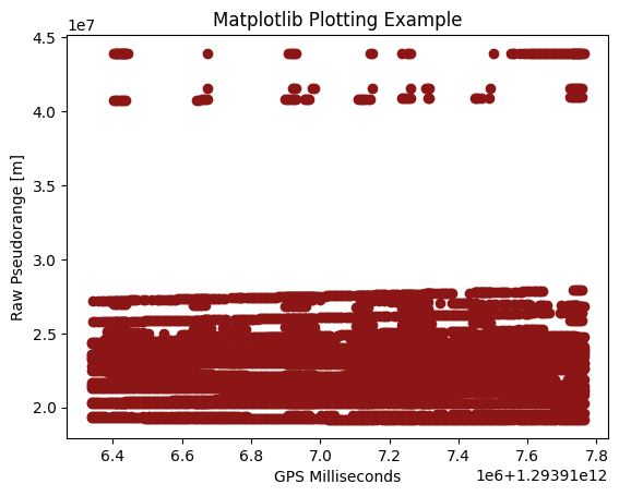
Since NavData is simply a data structure, you can still pull values from it and use standard Python plotting tools like matplotlib.
[2]:
import matplotlib.pyplot as plt
plt.scatter(derived_data["gps_millis"],derived_data["raw_pr_m"])
plt.xlabel("GPS Milliseconds")
plt.ylabel("Raw Pseudorange [m]")
plt.title("Matplotlib Plotting Example")
plt.show()
